
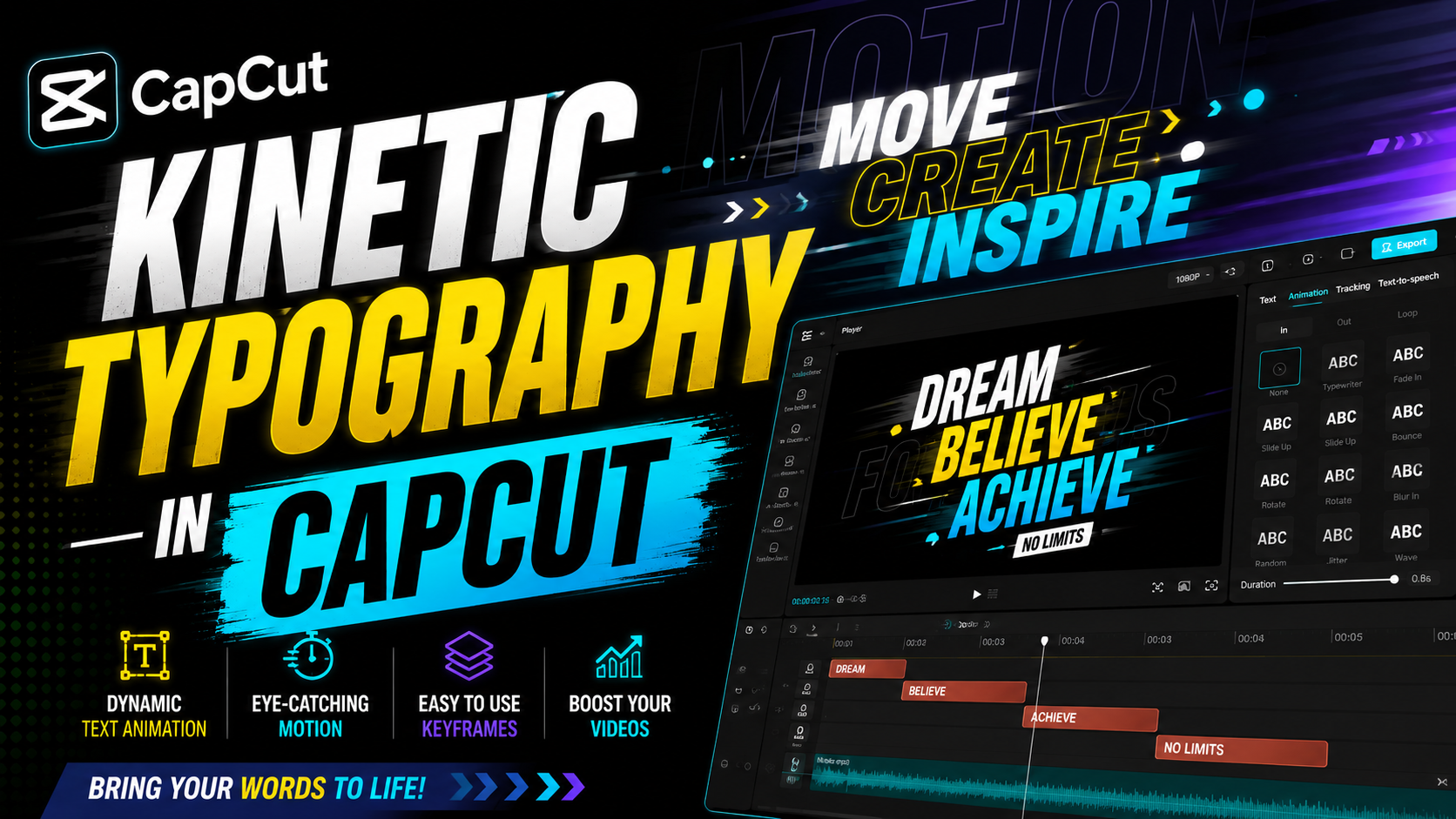

Kinetic Typography in Capcut 2026:
Introduction:
Kinetic Typography: Scroll through any social feed today and you’ll notice something: static text barely gets a glance, but words that move, pulse, and dance across the screen make people stop. That’s the power of kinetic typography — the art of animating text so it becomes a visual and emotional experience, not just something you read.
Whether you’re a content creator, marketer, or small business owner, kinetic typography has become one of the easiest ways to make your message memorable in 2026, when attention spans are shorter than ever and video-first platforms dominate. In this guide, you’ll learn what kinetic typography actually is, why it works, the best tools to create it, and practical steps to start animating your own text today — even with zero animation experience. Let’s clear Kinetic Typography.
What Is Kinetic Typography?
Kinetic typography, sometimes called “moving text” or “motion typography,” is the technique of combining text and motion to convey meaning, emotion, or emphasis. Instead of a sentence sitting still on a screen, individual words or letters might grow, shrink, bounce, fade, or fly in sync with audio, music, or narration.
This isn’t a new idea — filmmakers used early forms of it in movie title sequences decades ago. What’s changed is accessibility. Tools that once required professional animators are now available to anyone with a laptop and a story to tell.
Why It Works So Well Psychologically:
Moving text taps into how our brains are wired to notice motion before anything else. When a word animates in time with spoken emphasis, it reinforces meaning and helps viewers retain information longer than plain captions do.
Where Kinetic Typography Is Used in 2026:
You’ve probably seen kinetic typography without naming it. Common applications include:
Social media reels and shorts — animated captions that sync with speech
Explainer videos and tutorials — highlighting key terms as they’re spoken
Podcast video clips — turning audio into shareable visual content
Brand intros and title sequences — setting tone before content begins
Lyric videos — a long-standing favorite among musicians and fans
The Shift Toward Caption-Style Kinetic Text
One of the biggest trends this year is the rise of “auto-captioned” kinetic typography — where AI tools automatically animate spoken words as captions, word by word, matching tone and rhythm. This style now dominates short-form video because it keeps viewers watching without sound.
Best Tools for Creating Kinetic Typography:
You don’t need a film degree to get started. Here are some of the most popular options creators are using right now:
Beginner-Friendly Apps
Apps like CapCut and Canva offer drag-and-drop text animation templates, making them ideal for social media clips and quick projects.
Professional-Grade Software
For more control, tools like Adobe After Effects remain the industry standard, offering keyframe animation, custom easing, and precise sync with audio tracks.
AI-Assisted Platforms:
A newer wave of tools now auto-generate kinetic typography directly from a voice recording or script, cutting production time from hours to minutes. These are especially useful for creators publishing daily content.
How to Create Kinetic Typography: A Simple Step-by-Step Approach
Start with your script or audio. Kinetic typography almost always follows spoken words or a strong message.
Choose your emphasis points. Decide which words carry the most emotional or informational weight — these get the boldest animation.
Pick a motion style. Common styles include pop-in, typewriter, bounce, and fade — match the style to your brand’s personality.
Sync timing carefully. Even a half-second delay can make text feel disconnected from audio.
Keep it readable. Motion should support the message, not distract from it. Avoid overlapping too many effects at once.
Test on mobile first. Since most viewers watch on phones, always preview your animation at that size before publishing.
Common Mistakes to Avoid
Overusing effects — too many transitions can feel chaotic rather than engaging
Ignoring pacing — text that moves too fast becomes unreadable
Inconsistent fonts — switching styles mid-video weakens brand identity
Skipping accessibility — always ensure sufficient color contrast and readable font sizes for viewers with visual impairments
Kinetic Typography Trends to Watch in 2026
Grab this : Free Kinetic Typography Animation Templates By CapCut
Motion design is evolving quickly, and a few trends stand out this year:
Voice-reactive typography that adjusts animation speed based on tone of voice
Minimalist single-word emphasis replacing full-sentence animations for faster consumption
3D-style depth text used in short-form video intros
Brand-consistent animated fonts as companies build recognizable “motion identities,” much like they do with logos
Frequently Asked Questions:
What is kinetic typography used for? It’s primarily used to make spoken or written messages more engaging in videos, social content, ads, and title sequences by combining text with motion.
Do I need animation experience to create kinetic typography? No. Many beginner-friendly apps offer templates that require no prior animation skills, though professional tools give more creative control.
What’s the difference between kinetic typography and regular captions? Regular captions are static and simply display text. Kinetic typography adds movement, timing, and style to emphasize meaning and emotion.
Is kinetic typography good for SEO or marketing? Yes — video content with kinetic typography tends to have higher watch time and engagement, both of which support better performance on social and search platforms.
What software is best for beginners? Canva and CapCut are excellent starting points, while Adobe After Effects suits users wanting advanced customization.
Conclusion: Start Animating Your Words Today:
Kinetic typography isn’t just a design trend — it’s become a practical tool for anyone who wants their message to be seen, felt, and remembered. Whether you’re making a quick social clip or a polished brand video, the principles stay the same: sync your text to meaning, keep it readable, and let motion do the emotional heavy lifting.
Ready to bring your words to life? Pick one tool from this guide, apply the step-by-step process above, and create your first kinetic typography video today. Your audience will notice the difference.
Read more:
Leave a Reply