

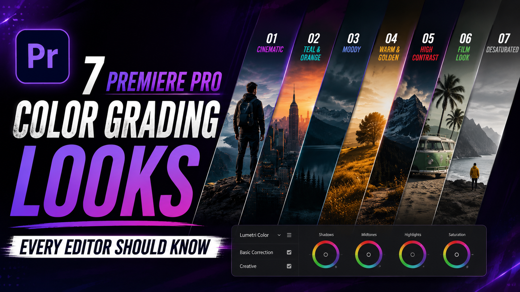

7 Premiere Pro Color Grading Looks Every Editor Should Know in 2026:
Premiere pro color grading: Staring at the Lumetri Color panel with no plan is one of the fastest ways to waste an hour of editing time. You nudge a slider, undo it, try a LUT, undo that too, and eventually land on something that’s fine but not quite what you pictured. Having a few reliable starting points changes that completely.
This guide breaks down seven specific Premiere Pro color grading looks, the kind you’ve seen in films, YouTube videos, and social content, along with the general Lumetri adjustments that get you there. Instead of starting from a blank slate every time, you’ll have a real recipe to build from and adjust to your own footage.
Why Starting From a Recipe Beats Starting From Scratch:
Professional colorists rarely start a grade with a completely empty panel. They start from a reference, a look they’ve used before, a LUT that’s close, or a known combination of adjustments, then refine from there based on the specific shot.
Working this way in Premiere Pro saves time and produces more consistent results across a full project, since you’re adjusting a known starting point rather than reinventing the wheel on every single clip.
Look 1: Classic Cinematic Teal and Orange
This remains one of the most recognizable grades in modern film and commercial work, pushing skin tones toward warm orange while shifting shadows and backgrounds toward cool teal.
How to build it: In the Color Wheels section, push the shadows wheel slightly toward blue/teal, and pull the midtones or highlights wheel slightly toward orange. Use HSL Secondary to protect skin tones from shifting too far if the effect feels unnatural on faces.
Look 2: Moody, Desaturated Drama
Popular in psychological dramas and modern streaming content, this look strips back saturation and deepens shadows for a more serious, subdued tone.
How to build it: Lower overall saturation in Basic Correction, increase contrast slightly, and lift blacks just enough to add a subtle fade rather than pure crushed shadows. A cool tint added through the shadows color wheel reinforces the mood.
Look 3: Warm, Golden-Hour Look
Common in lifestyle content, wedding videos, and travel vlogs, this grade mimics the warm glow of late-afternoon sunlight, even on footage shot at a different time of day.
How to build it: Warm up the white balance temperature slider, add a slight orange tint to highlights using the color wheels, and increase vibrance slightly without overdoing overall saturation.
Look 4: High-Contrast Commercial Look
This is the punchy, clean look common in product ads and branded content, designed to feel crisp and attention-grabbing rather than subtle.
How to build it: Increase contrast and clarity, boost saturation moderately, and use curves to deepen shadows while keeping highlights bright, creating a wider tonal range than a natural, unedited shot.
Look 5: Vintage Film Emulation
This look references analog film stocks, often used for nostalgic content, music videos, or anything aiming for a tactile, non-digital feel.
How to build it: Reduce contrast slightly, lift blacks to mimic film’s natural shadow softness, add a subtle color cast (often a light yellow or green tint), and consider layering a grain effect on top for texture.
Look 6: Clean, Neutral Corporate Look
Business and corporate video work usually calls for accuracy over style, prioritizing a natural, trustworthy look over anything stylized.
How to build it: Focus almost entirely on correction rather than creative grading, accurate white balance, moderate contrast, and natural saturation, without pushing any color wheel adjustments that would read as a “look.”
Look 7: Cool, Sci-Fi or Tech Aesthetic
Common in tech reviews, futuristic content, and gaming videos, this grade leans into cool blues and slightly desaturated skin tones for a more clinical, modern feel.
How to build it: Cool down the white balance, push shadows and midtones toward blue using the color wheels, and slightly desaturate skin tones using HSL Secondary so faces don’t clash with the overall cool cast.
Using Premiere Pro’s Color Mode to Refine These Looks Further:
Adobe’s newer Color Mode workspace, introduced in 2026 as a dedicated grading environment separate from Lumetri, gives more precise control when fine-tuning any of these recipes. Its 32-bit processing and dedicated Color Controls panel make subtle adjustments, like protecting skin tones in the teal-and-orange look or fine-tuning shadow detail in the moody drama look, noticeably easier to dial in than with Lumetri’s original sliders alone. As of 2026 it’s still in public beta, so treat it as a refinement tool alongside your existing Lumetri workflow rather than a full replacement yet.
Tips for Adapting Any Look to Your Own Footage:
Start subtle, then push further. It’s easier to add more intensity to a grade than to walk back an overcorrected one.
Always check skin tones last. A great overall mood means nothing if faces look unnatural or sickly.
Use scopes, not just your monitor. Waveforms and vectorscopes catch issues your eyes might miss, especially on an uncalibrated screen.
Save custom presets. Once you land on a version of a look you like, save it as a preset so you can apply and tweak it quickly on future projects.
Frequently Asked Questions for Premiere pro color grading:
What is the most popular color grading look in Premiere Pro? Teal and orange remains one of the most widely used cinematic grades, prized for creating visual contrast between warm skin tones and cooler backgrounds.
How do I get a moody, film-like grade in Premiere Pro? Lower saturation, increase contrast slightly, lift blacks for a subtle fade, and add a light cool tint to shadows using the Lumetri color wheels.
Can I save a color grade as a preset in Premiere Pro? Yes. Once you’ve built a grade you like in the Effect Controls panel, you can save it as a preset, allowing you to apply the same starting look to other clips instantly.
Do I need Premiere Pro’s new Color Mode to create these looks? No. All seven looks in this guide can be built using the standard Lumetri Color panel. Color Mode simply offers more precise refinement tools for editors who want additional control.
What’s the easiest color grading look for beginners to start with? The clean, neutral corporate look is the simplest starting point, since it focuses on accurate correction rather than complex creative color wheel adjustments.
Final Thoughts:
Premiere pro color grading: Having a handful of reliable color grading recipes turns Premiere Pro’s Lumetri panel from an intimidating wall of sliders into a genuinely fast creative tool. Pick the look that matches your project’s tone, use it as a starting point, and adjust based on your specific footage rather than building every grade completely from scratch.
Try applying one of these seven looks to your next project, save it as a preset once you’re happy with it, and you’ll have a reusable starting point ready for the next edit.
The Ultimate Guide to Color Grading in Premiere Pro
Watch all the video editing tutorials here: Video Editing Tutorials

Leave a Reply